
New Default Theme for Forms, Surveys, and Quizzes
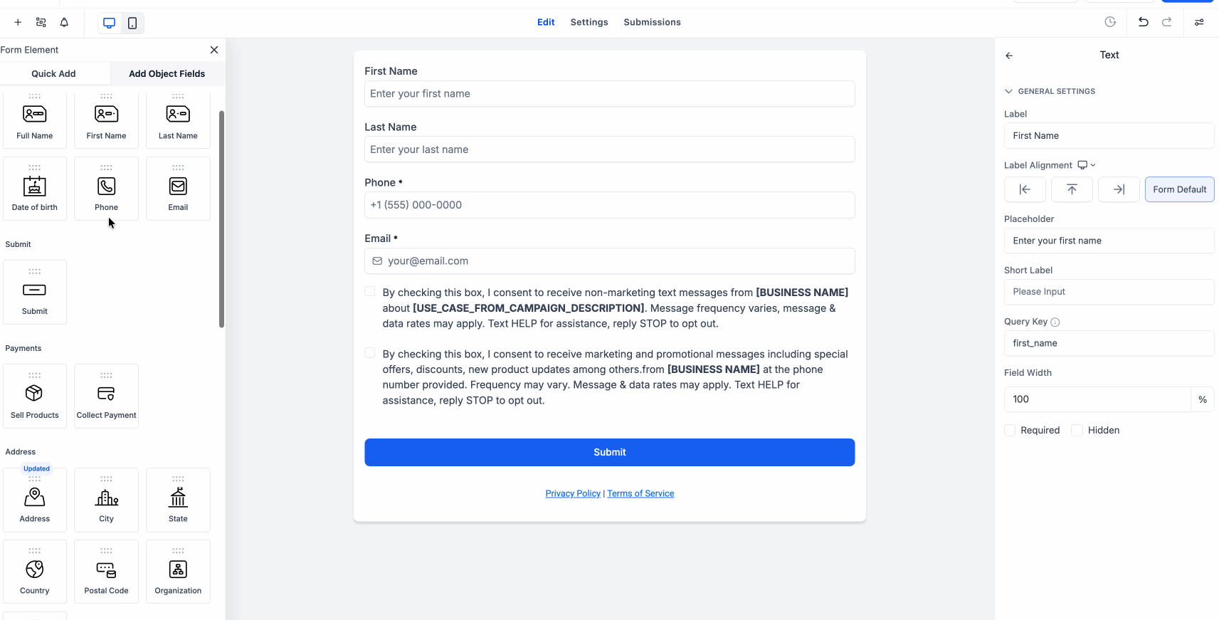
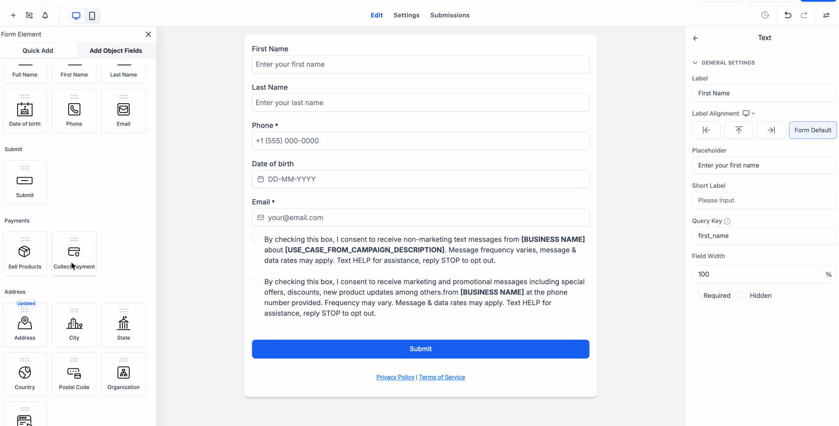
We’ve introduced a new default theme for Forms, Surveys, and Quizzes, offering a cleaner, more polished appearance right from the start.
This update refreshes the overall design and enhances several key components, ensuring a more consistent builder experience while giving the final forms a modern look.
-
A refreshed default look:
Forms, surveys, and quizzes now feature updated fonts, improved spacing, rounded corners, and a cleaner overall design.
-
Better input styling:
Checkboxes, radio buttons, monetary fields, and other inputs now exhibit a more polished and consistent appearance.
-
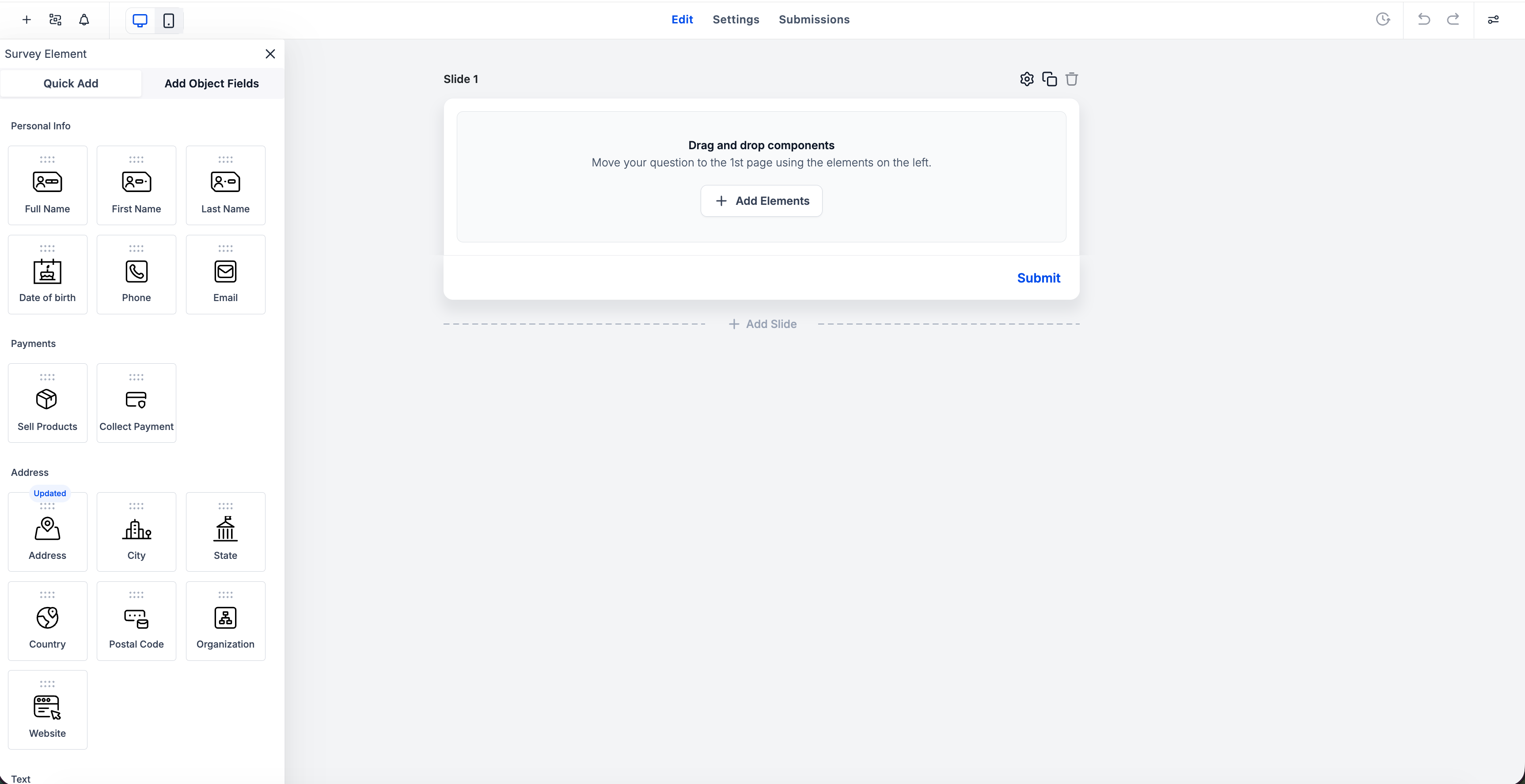
Improved empty states:
Blank screens are replaced with clearer empty states when all content is removed.
-
A redesigned file upload field:
File upload fields now display supported file types, upload size limits, improved icons, and configurable header text.
-
Collect payment improvements:
The payment component now features enhanced styling, configurable header text, clearer empty states, and a direct Add Product option.
-
Date and signature updates:
Date placeholders now automatically update based on the selected format, and signature fields now support custom placeholder text.
-
More theme consistency:
Elements such as images, labels, placeholders, footer colours, and chips now align better with the overall theme.
- Open the Form, Survey, or Quiz Builder, and create a new form or edit an existing one.
- You’ll notice these updates across the default theme and supported components like file upload, collect payment, date picker, signature, checkboxes, radio buttons, and more.
- This update provides a more modern default appearance for your forms, surveys, and quizzes, requiring less manual styling.
- It enhances clarity in empty states, simplifies component understanding for end users, and grants you greater control over how key elements look and behave.
Surveys & Quiz Empty States: