Hover Animations for Buttons | Clixio Changelog
Buttons can now respond dynamically when a visitor hovers over them. Choose from 21 built-in hover effects and fine-tune parameters such as colour, size, distance, and timing directly in the sidebar—no custom CSS required.
🚨 Problem / Opportunity
Previously, buttons had very limited hover capabilities, restricted only to basic elevate and wobble effects, with no customisation options. Creating engaging micro-interactions required writing custom CSS, which many users found inaccessible and difficult to maintain across templates. Since hover states are essential for making CTAs feel responsive and clickable, this represented a significant gap in the builder.
🌟 What’s New / How to Use
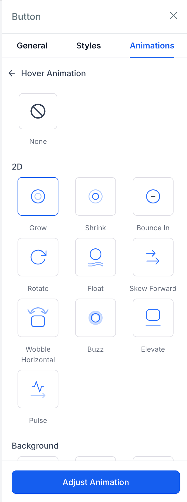
- 21 New Hover Effects: Instantly apply effects grouped into six customisable categories:
- Scale: Grow, Shrink, Pulse, Bounce In
- Rotation: Rotate, Skew Forward
- Movement: Float, Wobble Horizontal, Buzz
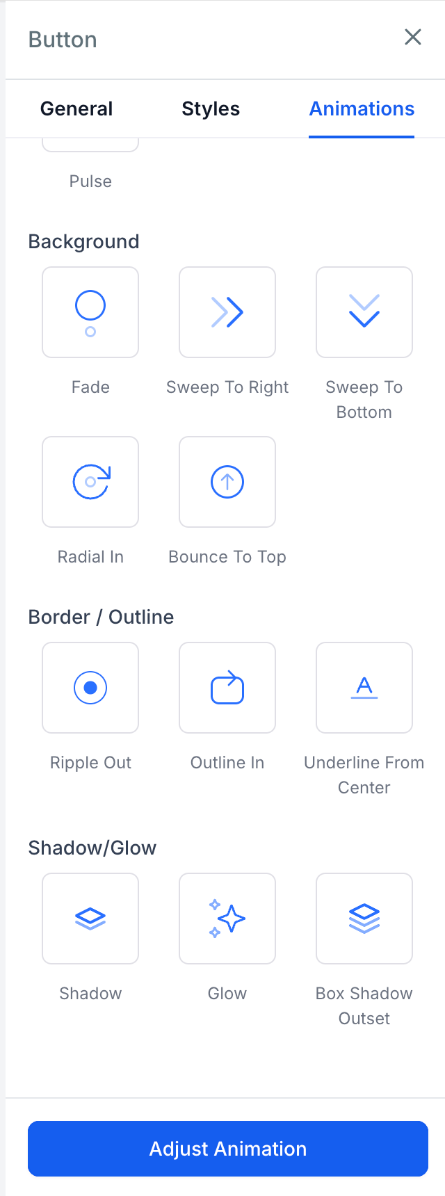
- Background: Fade, Sweep To Right, Sweep To Bottom, Radial In, Bounce To Top
- Border: Ripple Out, Outline In, Underline From Centre
- Shadow: Shadow, Glow, Box Shadow Outset
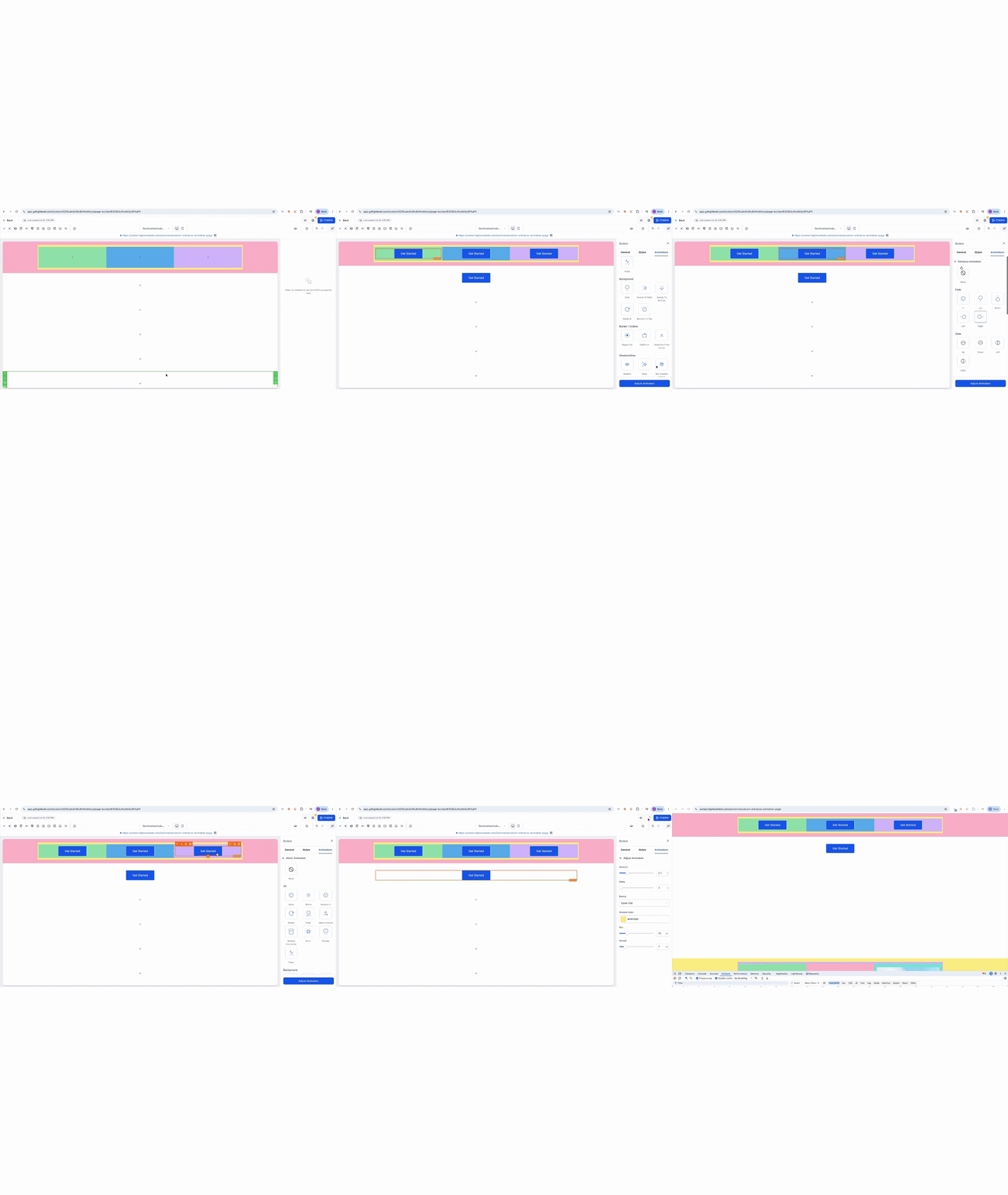
- Live Canvas Previews: Hover over any effect card in the sidebar to preview the animation live on your canvas button before selecting it.
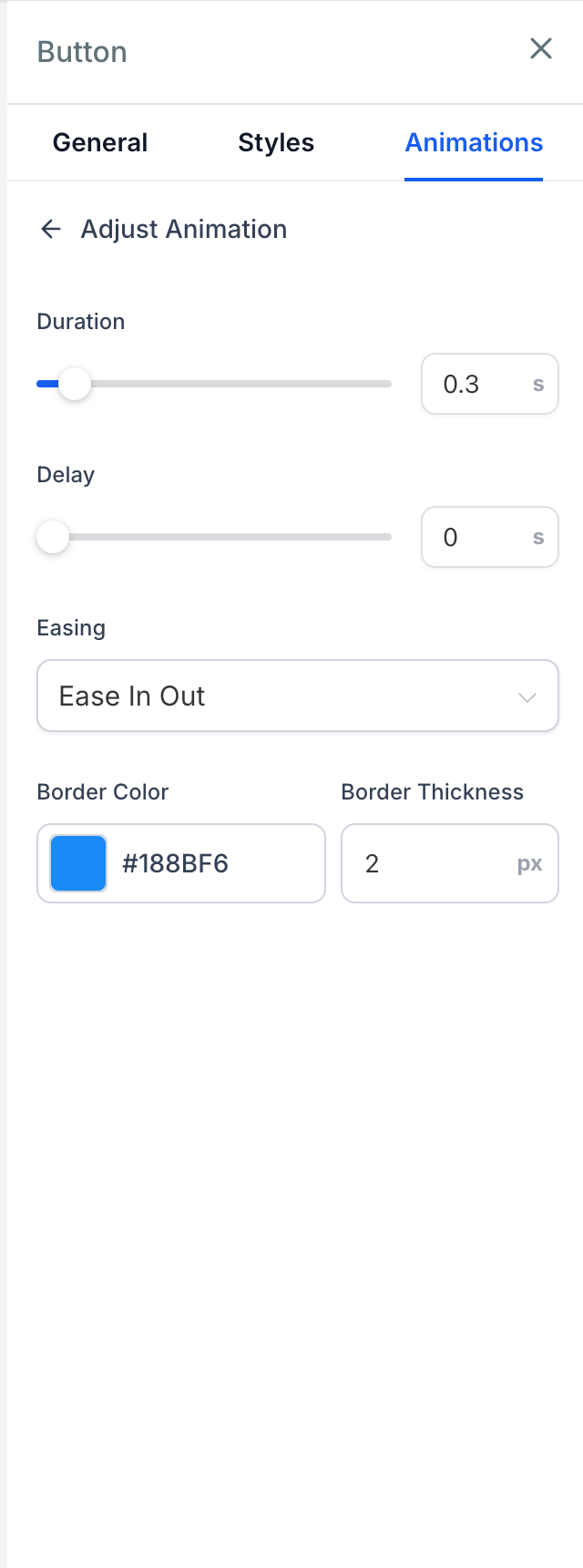
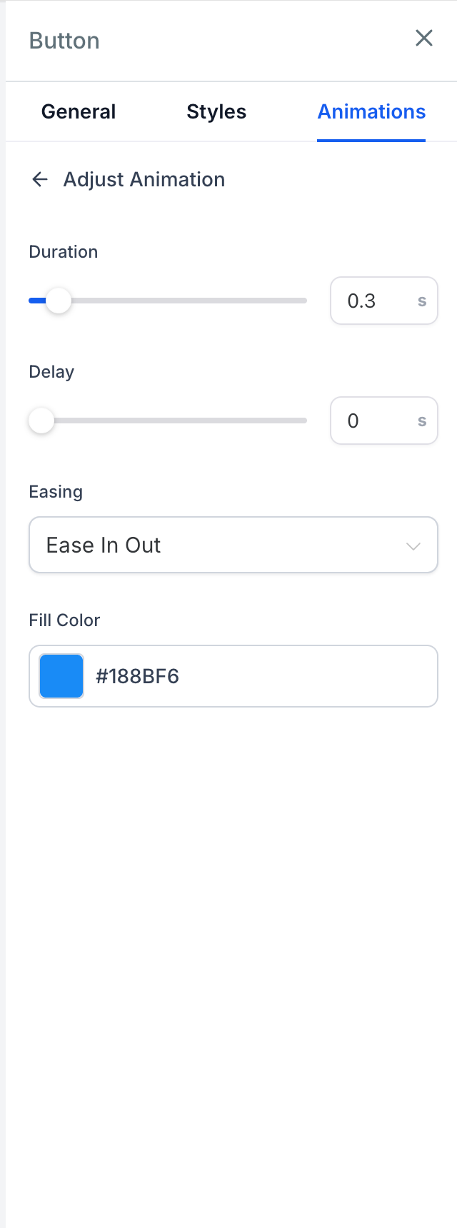
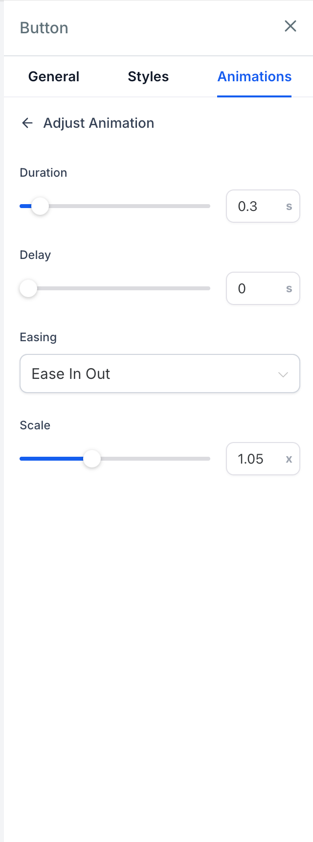
- Contextual Fine-Tuning Controls: Each effect exposes core timing controls (Duration: 0.1–3s, Delay: 0–5s, Easing: Linear, Ease-in, Ease-out, Ease-in-out), while dynamically surfacing only the specific parameters relevant to the selected effect:
- Scale Controls: Scale factor (0.5x to 2x)
- Rotation Controls: Angle (-180° to 180°)
- Movement Controls: Distance (0 to 50)
- Background / Border Controls: Fill colour, border colour, and thickness (1px to 10px)
- Shadow Controls: Shadow colour, blur (0 to 50px), and spread (0 to 50px)
- Smart Device & State Handling:
- Mobile-Safe: Hover states automatically disable on touch devices and screen widths below 1024px to avoid “stuck” hover states.
- Sequenced with Entrance Animations: If a button has an entrance animation, hover effects will wait until it finishes before activating.
- Replicated Elements: Clones, sticky bar buttons, and navigation duplicates mirror the hover behaviour of the original element seamlessly.
- Steadier Canvas Animations: Entrance animations no longer replay on component remounts (during drag-and-drop or device switching) and wait until elements are visible on screen.
⚙️ How to Use It
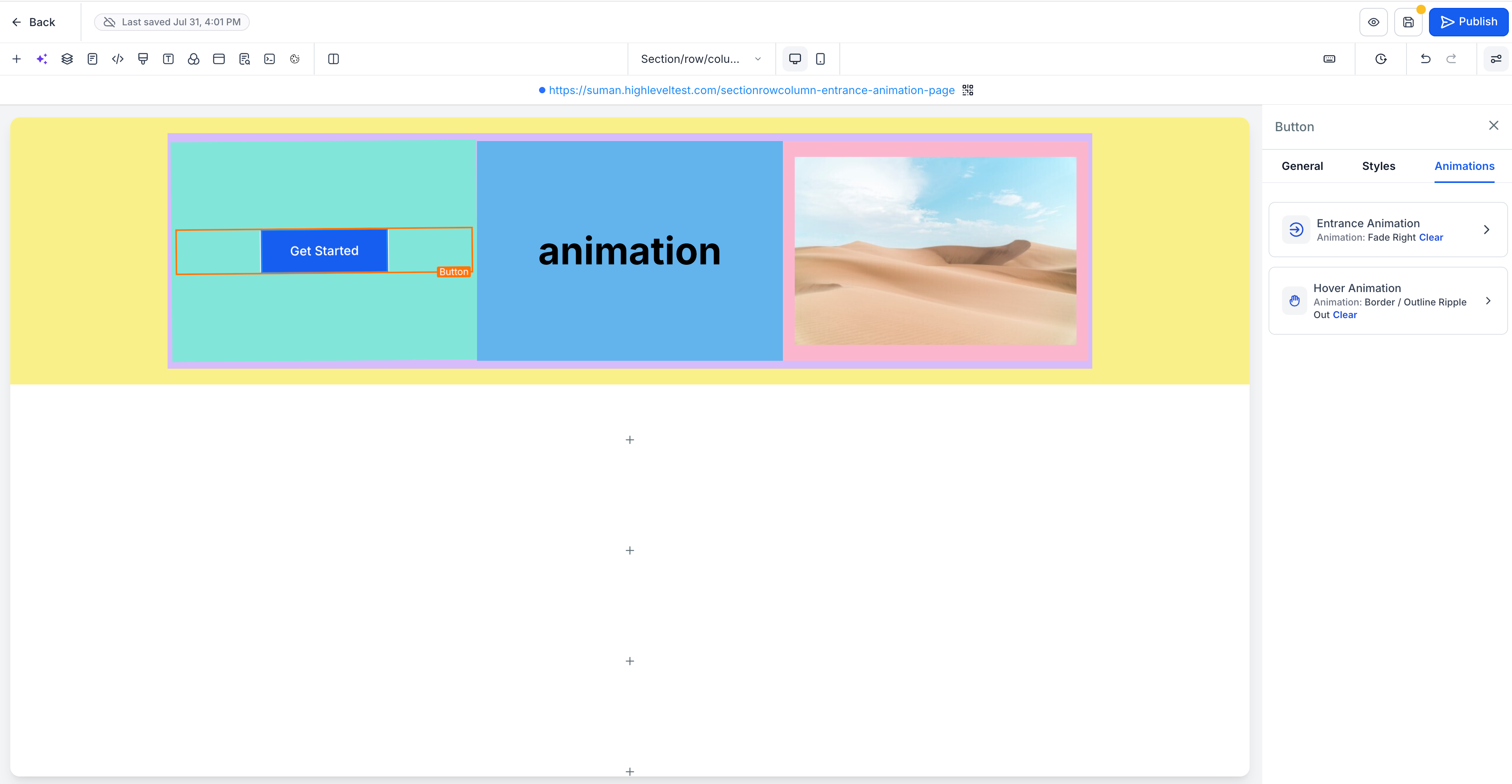
- Select any button on the builder canvas.
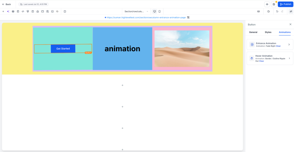
- Open the Animation tab in the sidebar and navigate to Hover Animation.
- Hover over any effect card to preview it on the selected button.
- Click an effect to select it.
- (Optional) Adjust timing or specific parameters (colour, scale, distance) in the Adjust panel below the effect grid.
🎯 Impact
- No CSS Knowledge Needed: Build polished micro-interactions directly from the sidebar.
- Higher CTA Engagement: Make buttons feel tactile and interactive to boost click-through rates.
- Clutter-Free Interface: Contextual controls ensure you only see the settings that apply to your chosen effect.
- Cleaner Markup: Hover settings are applied as clean CSS styling without bloating the published page code.
📍 Where to Find It
Go to Page Builder → select a Button → open the Animation tab in the sidebar → Hover Animation.
Effect parameters appear in the Adjust panel right below the grid.