
Brand Board Colors in the Forms & Surveys Color Picker!
You can now access your Brand Board colours directly from the Builder colour picker, making it easier to maintain consistency across your pages and forms.
This update allows teams to quickly apply saved brand colours, access Brand Settings to add new custom colours, and use those colours in the Builder without manually copying hex codes.
- The colour picker now features three sections: Brand Colours, Default Colours, and Global Custom Colours.
- You can use saved brand colours directly when styling elements such as buttons, inputs, labels, and shadows.
- Default Colours are shared across Forms, Surveys, and Quizzes.
- A new Add option in Global Custom Colours opens Brand Settings, facilitating the addition or management of custom colours.
- When you select a saved brand colour, the Builder automatically displays the correct colour preview.
- Matching custom colours are saved as brand-linked values, which helps maintain consistency across your designs.
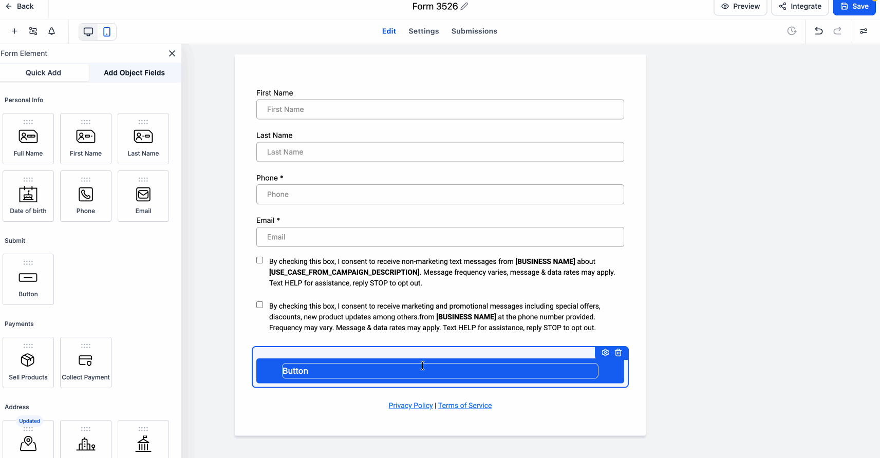
- Open the Form Builder and select any element that has colour settings, such as a button.
- Under the style settings, click a colour field like Button Background to open the colour picker. Here, you will find Brand Colours, Global Custom Colours, and Default Colours.
- To add a new custom brand colour, click Manage from the colour picker to access Brand Settings.
- This update simplifies the process of staying on-brand while creating pages and forms.
- Instead of manually entering and reusing colour codes, you can select from your saved brand palette, ensuring more consistent styles across assets, and easily update custom colours from a single location.
- Apply your brand’s primary and secondary colours to buttons and form fields more quickly.
- Ensure consistent page and form styling across multiple team members.
- Add a new custom brand colour from the picker without interrupting your workflow.