Contact Detail Page Redesign | Clixio Changelog
Overview: Based on feedback from Labs, this release enhances overall UI clarity by improving colour contrast, increasing feature visibility, and optimising the placement of key page elements.
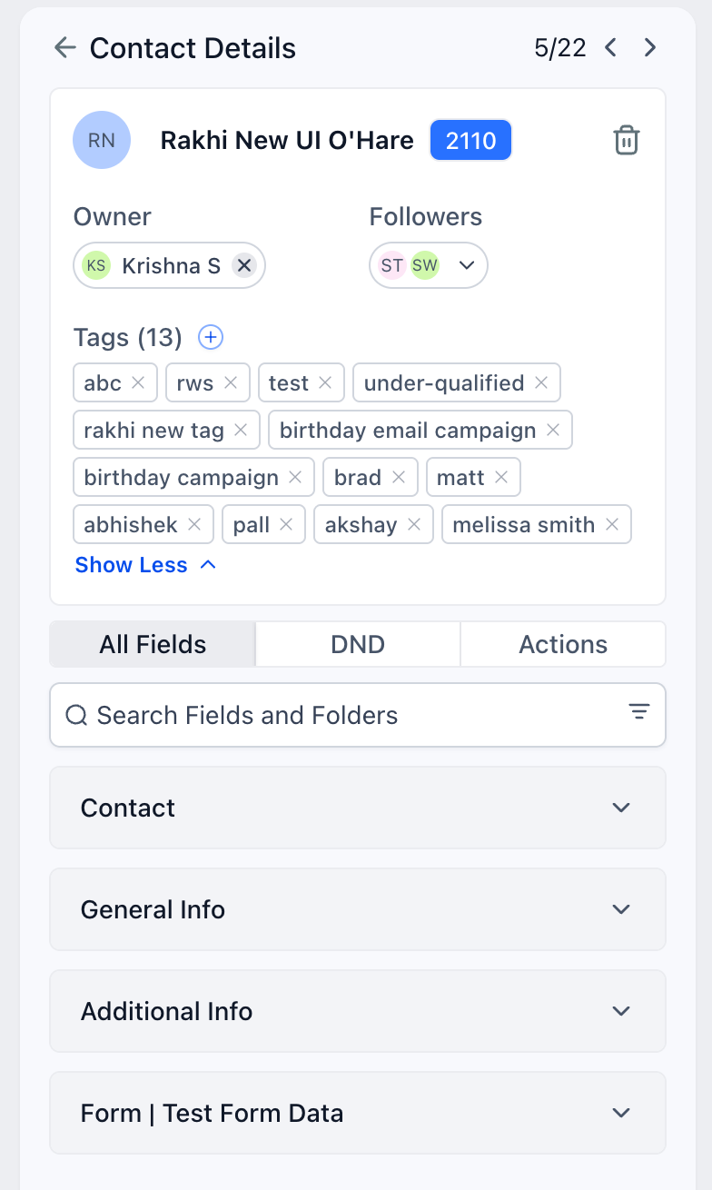
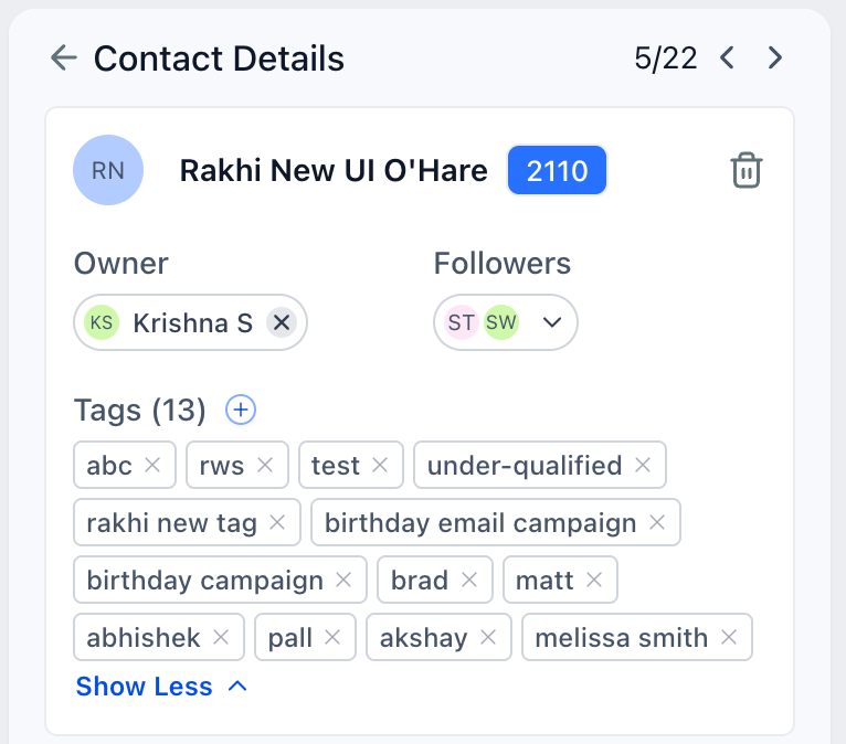
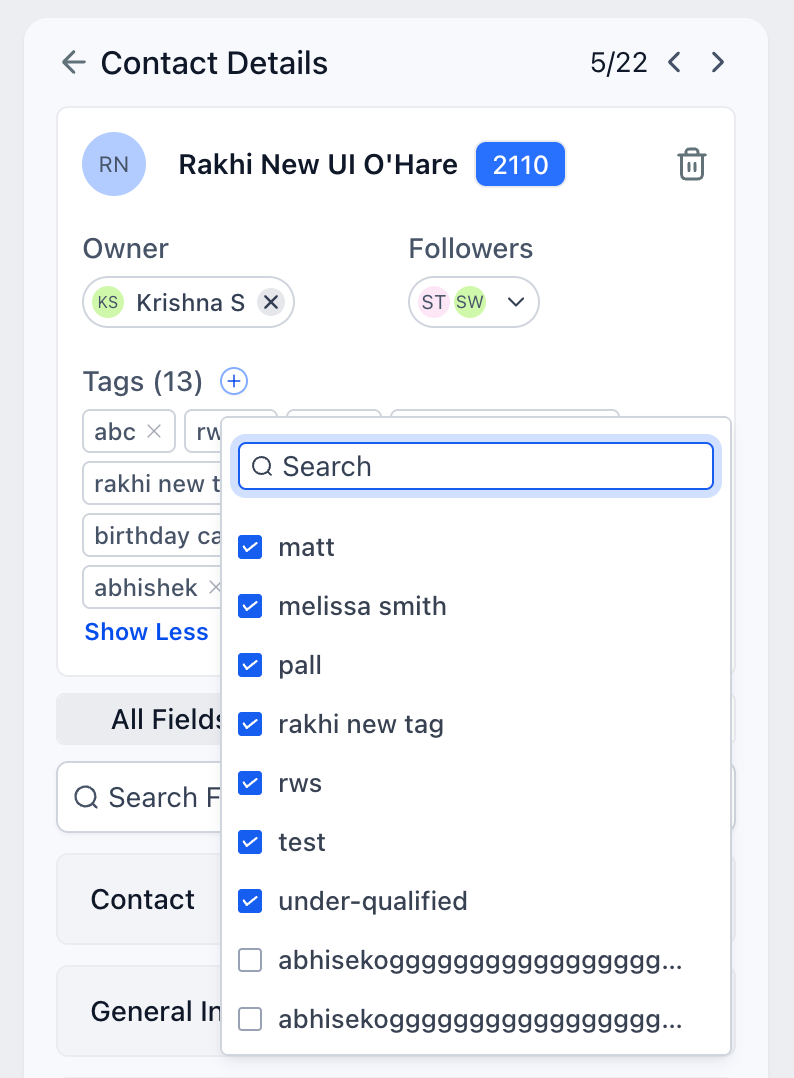
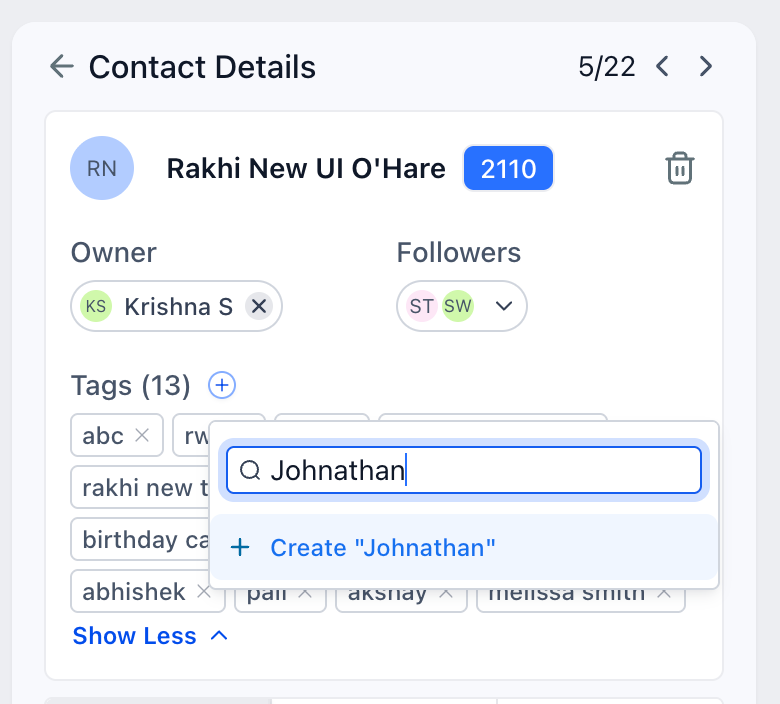
The functionality of the page remains largely unchanged. Users can now create new tags directly from the contact card section.
What’s New in UI
• Colour Contrasts and Better Visibility
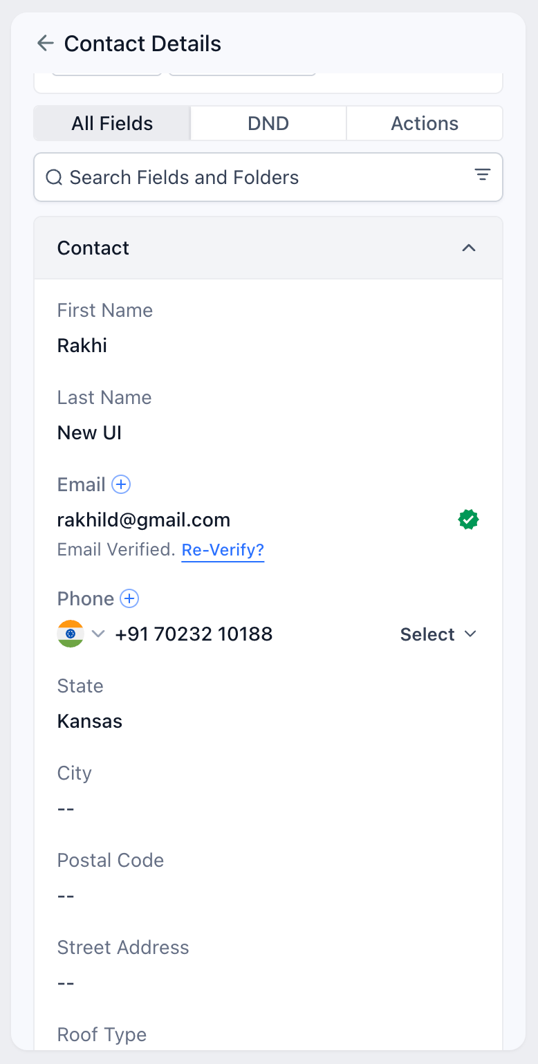
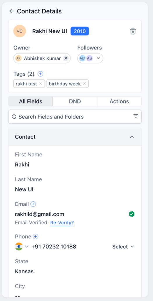
Input fields have been darkened to distinguish them from their corresponding field names (which are now two shades lighter). Customers can now easily recognise this change, which was previously visually confusing.
• Empty Fields
Empty fields are now indicated by double dashes, and the colour of input fields has been slightly darkened compared to the field text to enhance readability.
• Folder Colours
The UI now displays folders with a grey background to clearly differentiate between existing fields and folders.
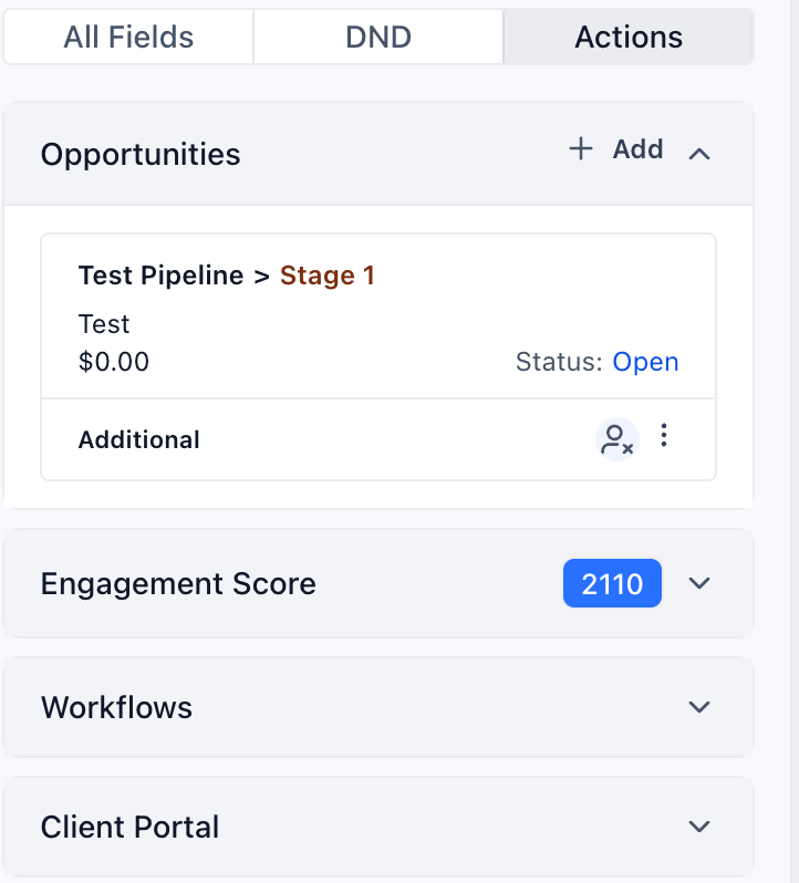
• Opportunities Moved Under Actions
This feature was highly requested. Customers preferred a simpler way to view and add new opportunities, and the new flow significantly reduces both the number of clicks and the time required. The entire card is now clickable.
• Tags Display
The tags addition pop-up has been widened and improved for clarity. Tags are now displayed fully, and the tags section can now be expanded or collapsed.
• Engagement Score
The engagement score is now displayed next to the contact name in the contact card. Clicking on this score opens the engagement score section.
• Add Additional Phone and Email
This feature is now located within the contact folder, eliminating the need for users to search by folder name.
• Delete Contact
To improve usability, the three-dot menu on the contact card has been replaced with a delete icon, making it easier to find the delete action.