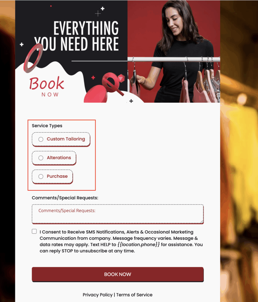
Bubble Style for Radio & Checkbox Elements
A new Bubble Style option is now available for radio buttons and checkboxes in forms, surveys, and quizzes.
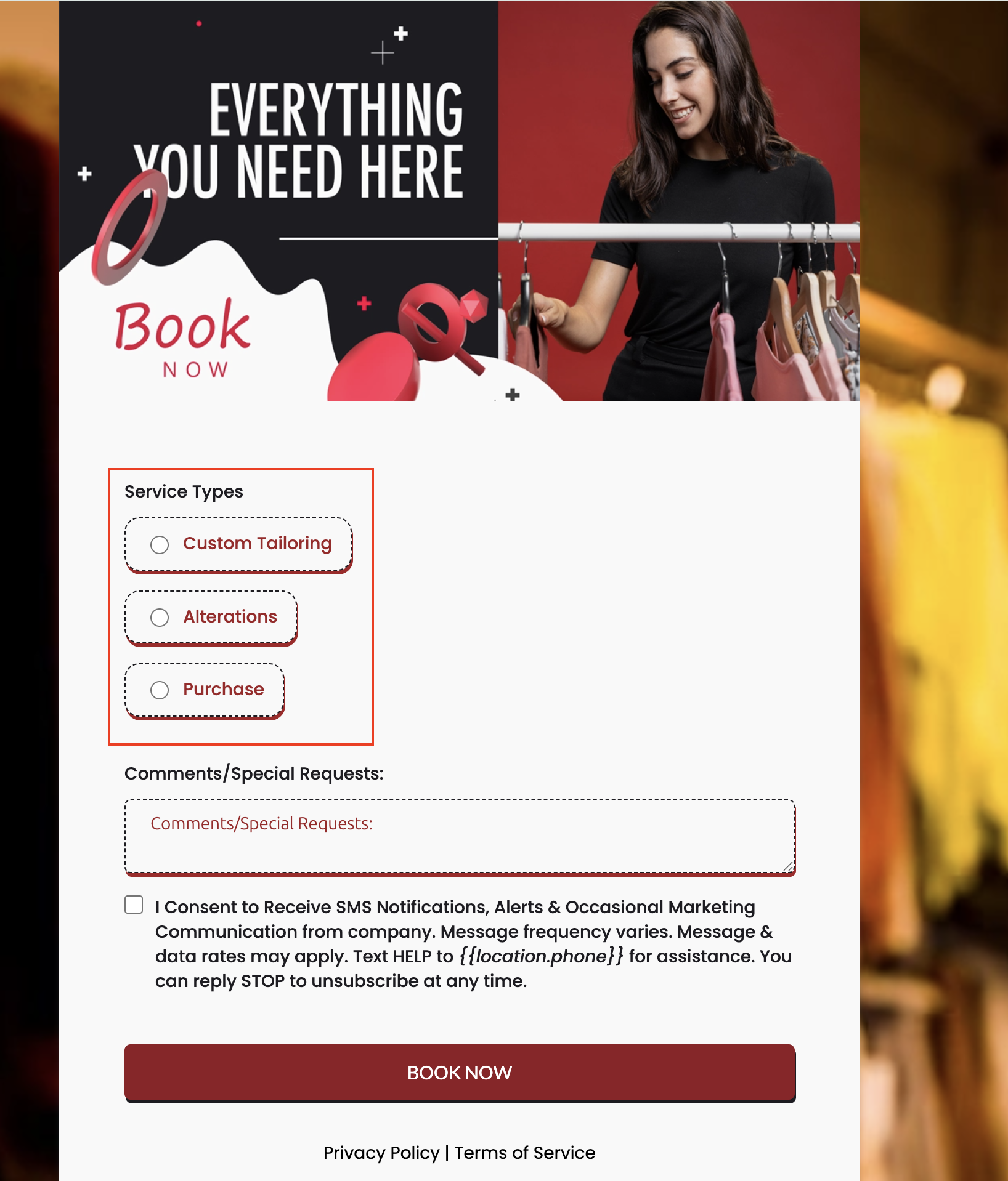
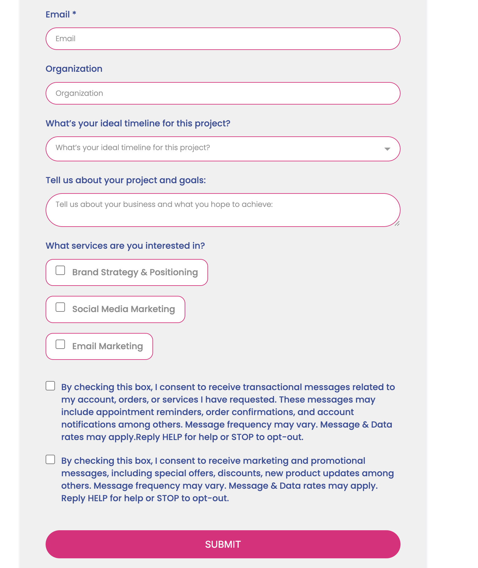
- Bubble design offers a modern, rounded look for choice fields.
- Toggle easily between Standard and Bubble styles in the Options tab.
- Enhanced clarity and interactivity for end-users.
- Fully responsive across all device types.
- Add a Radio or Checkbox field in your form.
- Navigate to the Options tab.
- Select either:
- Standard – the classic appearance.
- Bubble – the new rounded style.
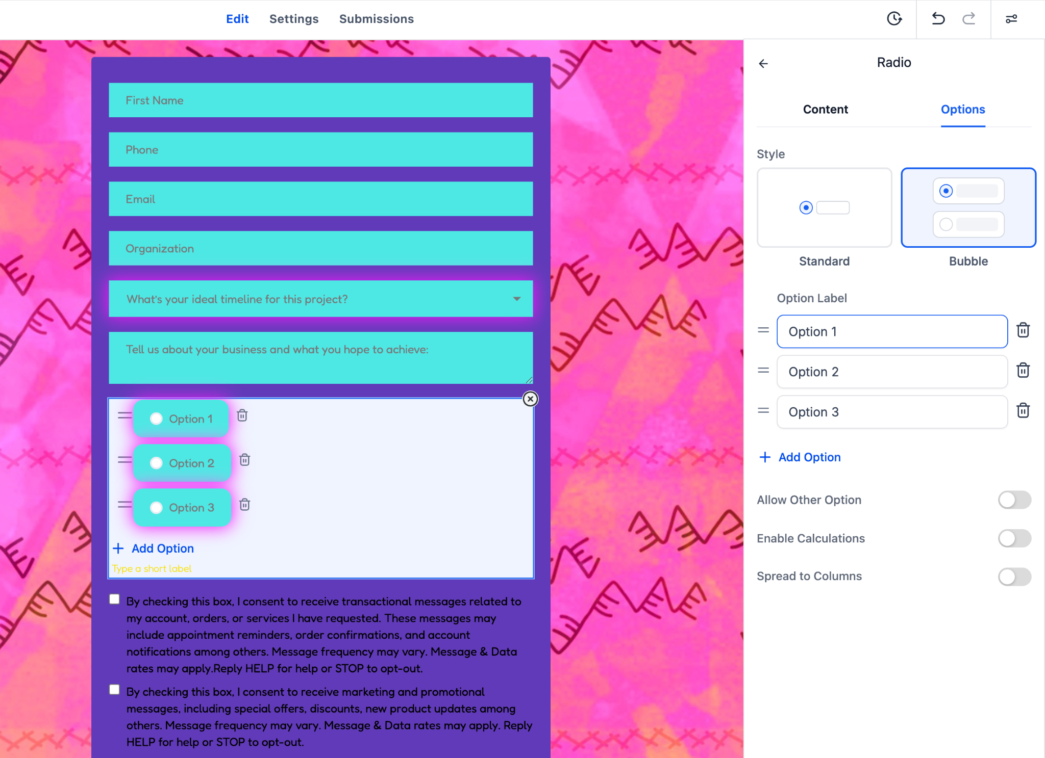
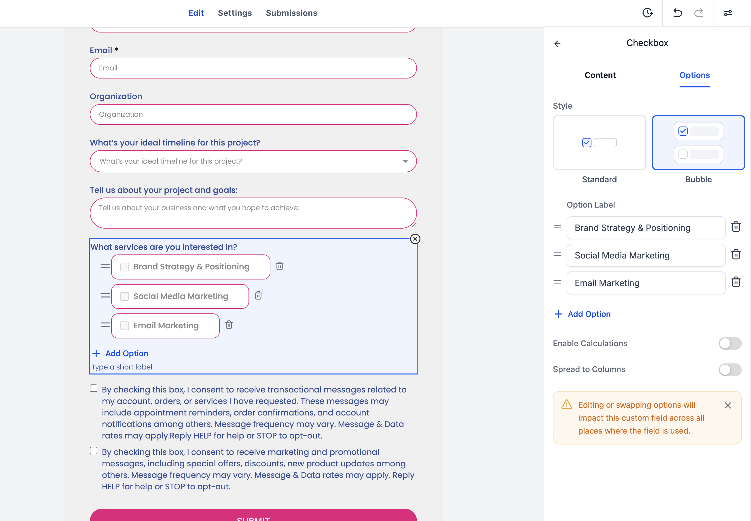
- Save and preview to see changes applied instantly.
- Bubble styling is purely visual – it has no impact on logic, validations, or integrations.
- All existing forms remain compatible – no migration is required.